DARLING CITIZEN
Designing an improved user flow for live online classes with profitability, clarity and growth in mind.

ROLES AND RESPONSIBILITIES
I am the designer and facilitator of the design sprint for Darling Citizen. I worked a few hours a week consulting with a senior designer throughout the process of this sprint.
SCOPE AND CONSTRAINTS
This was a four week design sprint to develop a mobile and web prototype for local business, Darling Citizen. The sprint was based off of AJ &Smarts Design Sprint, but modified to work for a team of two.
OVERVIEW
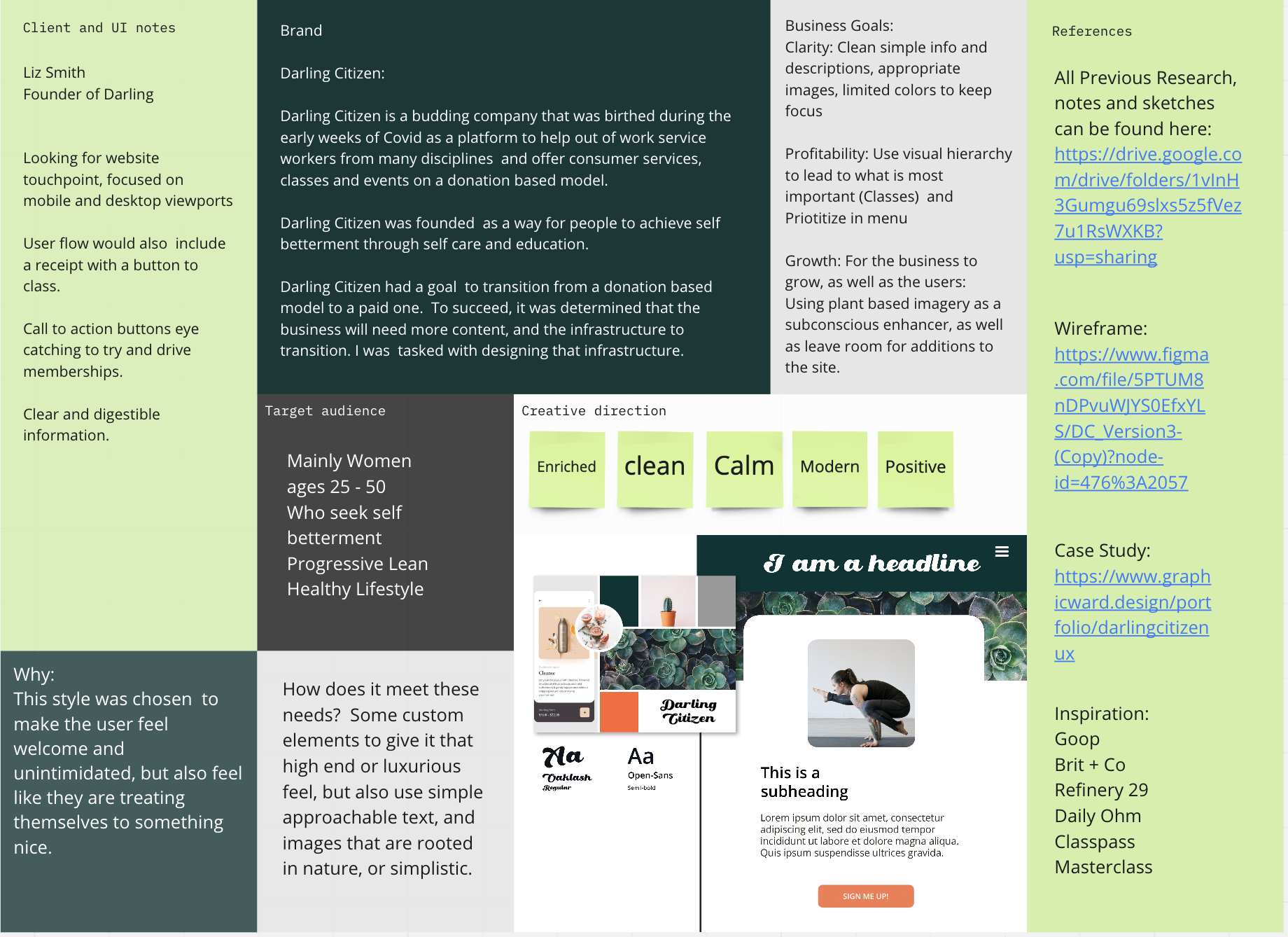
Darling Citizen is a budding company that was born during the early weeks of Covid as a platform to help out of work service workers from many disciplines and offer consumer services, classes and events on a donation based model.
Darling Citizen was founded as a way for people to achieve self betterment through self care and education.
Darling Citizen had a goal to transition from a donation based model to a paid one. To succeed, it was determined that the business will need more content, and the infrastructure to transition. I was tasked with designing that infrastructure.
IDEATION
First thing I did was sit down with the owner of Darling Citizen and interviewed her. We discussed her target market and brand in detail. Together we also identified many of the companies long term goals, and problems that needed to be solved.

We then narrowed down our focus for this Design Sprint.
PROBLEM STATEMENT
To begin problem solving, the problems were phrased as questions.
These are the questions that we needed to find answers to:
How might we generate income?
How do we convey clarity?
How do we gain more members?
OTHER EARLY RESEARCH
In addition to the interview with the stakeholder, I sent out a survey to existing Darling Citizen experts to better understand their point of view and see who their clients were. Currently, Darling Citizen generates most of its current users through the personal networks of the experts on the site.
Through this I found some clarity. For example the target market was predominately female which matched what we were expecting, but the typical age of the current users were significantly older than the target market

EMPATHY MAPS
With those questions in mind, I focused on the users of Darling Citizen. With what information I had gathered from Darling Citizens Experts as well as the proposed target market, I developed empathy maps to put the users front and center in the design process.
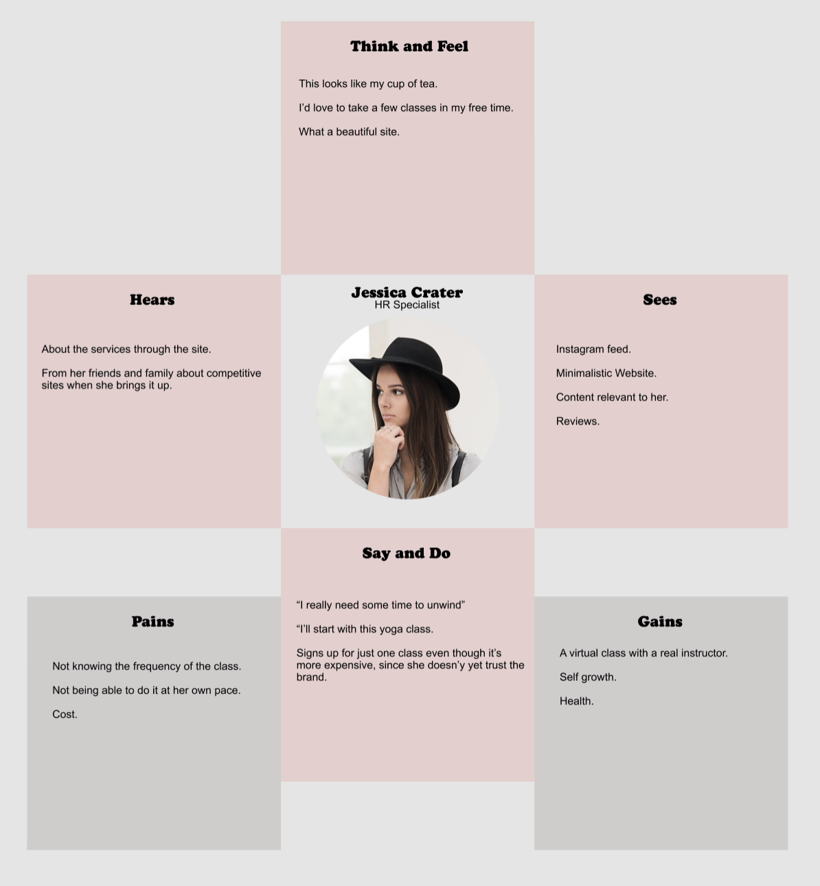
My main persona was Jessica, a young professional who used the site to take a yoga class.
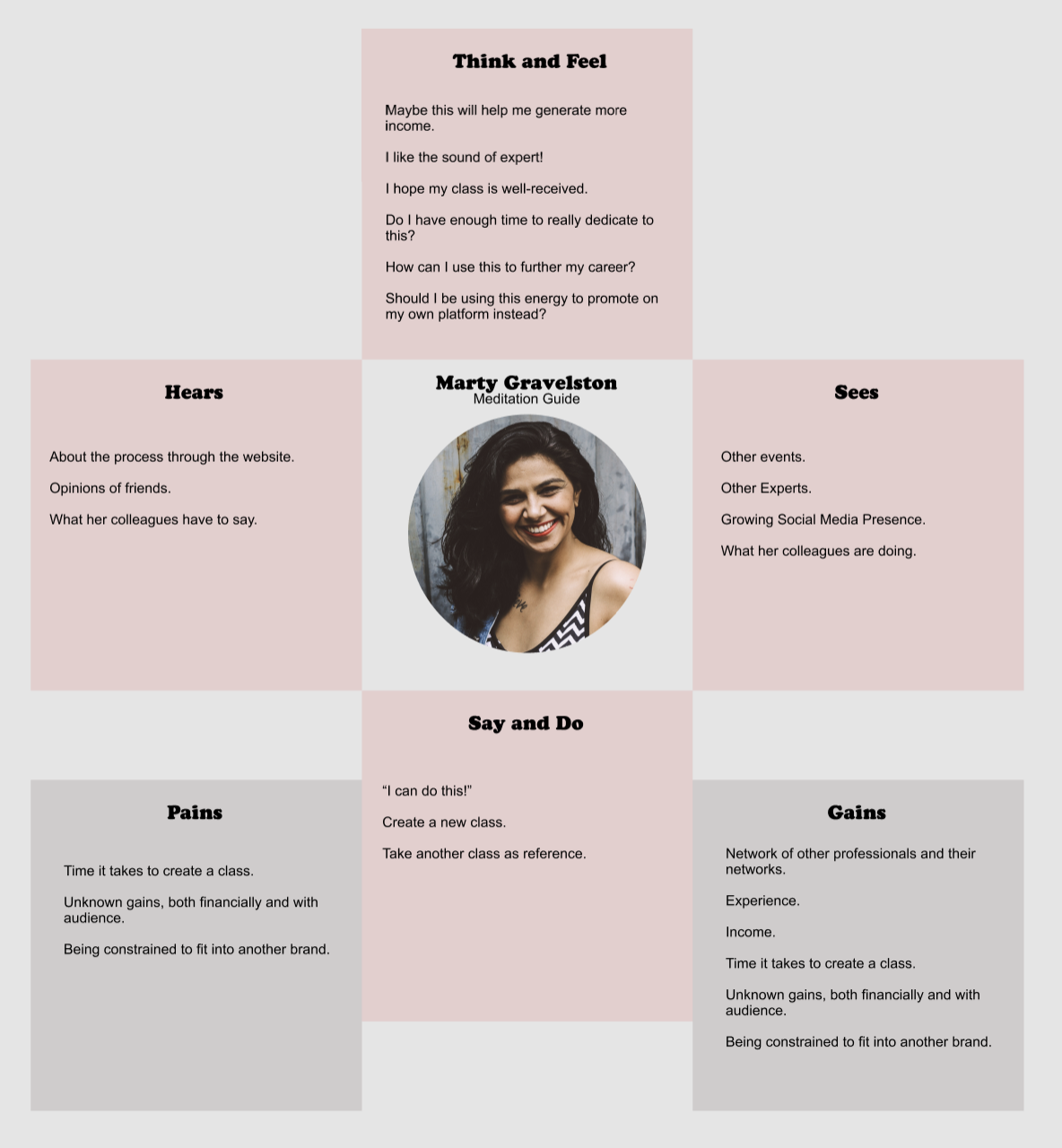
I also developed a second persona Marty and made an empathy map for her as well. She represented someone who would be teaching a class on the site.
Although this design sprint was entirely focused on the class takers such as Jessica, I wanted to be sure that I didn’t inadvertently make design decisions that would make the experience for the class teachers less optimal. That is why I also included Marty in my design sprint.
COMPETITIVE ANALYSIS

I also looked at how Goop, Brit + Co, Refinery29, DailyOM, and Masterclass and Classpass were configured. I wanted to see how other companies with a similar target market, or that were offering classes set up.
Through some of those sites I found bits and pieces that could be implemented into the Darling Citizen User Flow. I drew inspiration from other sites as well.
SKETCHES
With the research, personas and inspiration in mind,
I drew out three possible solutions for each of the problems we wanted to solve in this sprint. I then did a heat map exercise with the stake-holder, with her as the decider to choose what ideas to test.

FLOWCHART
After the target was picked, I made a flowchart.

Which I later updated to add the class rating as well. Since we were able to solve the membership and profitability problems with one feature, I added back in this feature from my sketches to help with the clarity problem.

STORYBOARD
Based on that flowchart, I began to breakdown what that process would actually look like for the user. Through my research I learned that many users would sign up for classes on their phones, and then take the actual class on their desktop or laptop. I wanted to be sure that my storyboard reflected that unique flow.

EARLY PROTOTYPES
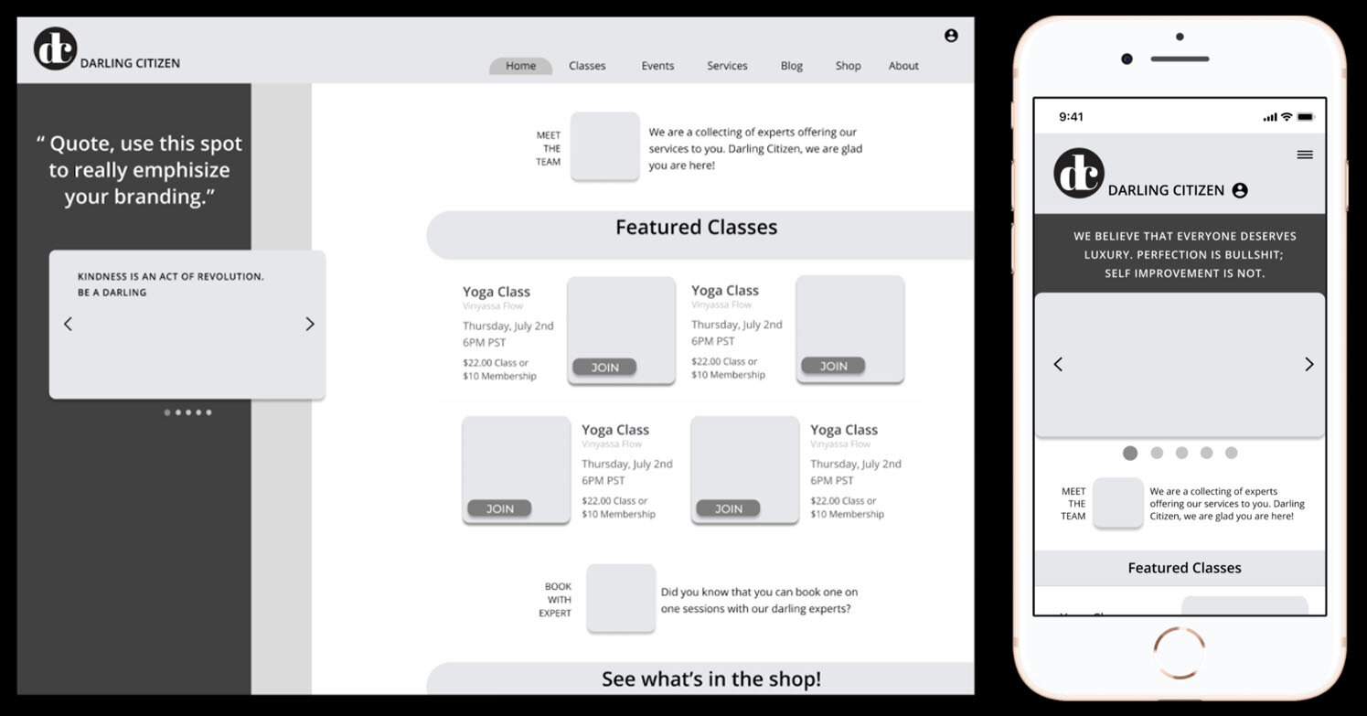
I then proceeded to sketch out what the actual product might look like.

SOLVING THE PROBLEMS
As a way to make Darling Citizen profitable and gain more members, I designed a screen where people can choose between a single class or a membership when they sign up for a class.
As a way to make getting into class clear and user friendly there is a button that they can access directly through their e-mail receipt. This was originally going to go in the header too, but was dismissed once I realized that some users would be members, and others would not. That would require some type of gatekeeping of the class access, which would make the button in the header less optimal.
Lastly, as a a way to better label classes, I made a screen that enabled users to leave simple feedback, so classes could be rated and more accurately labeled.

WIREFRAMING
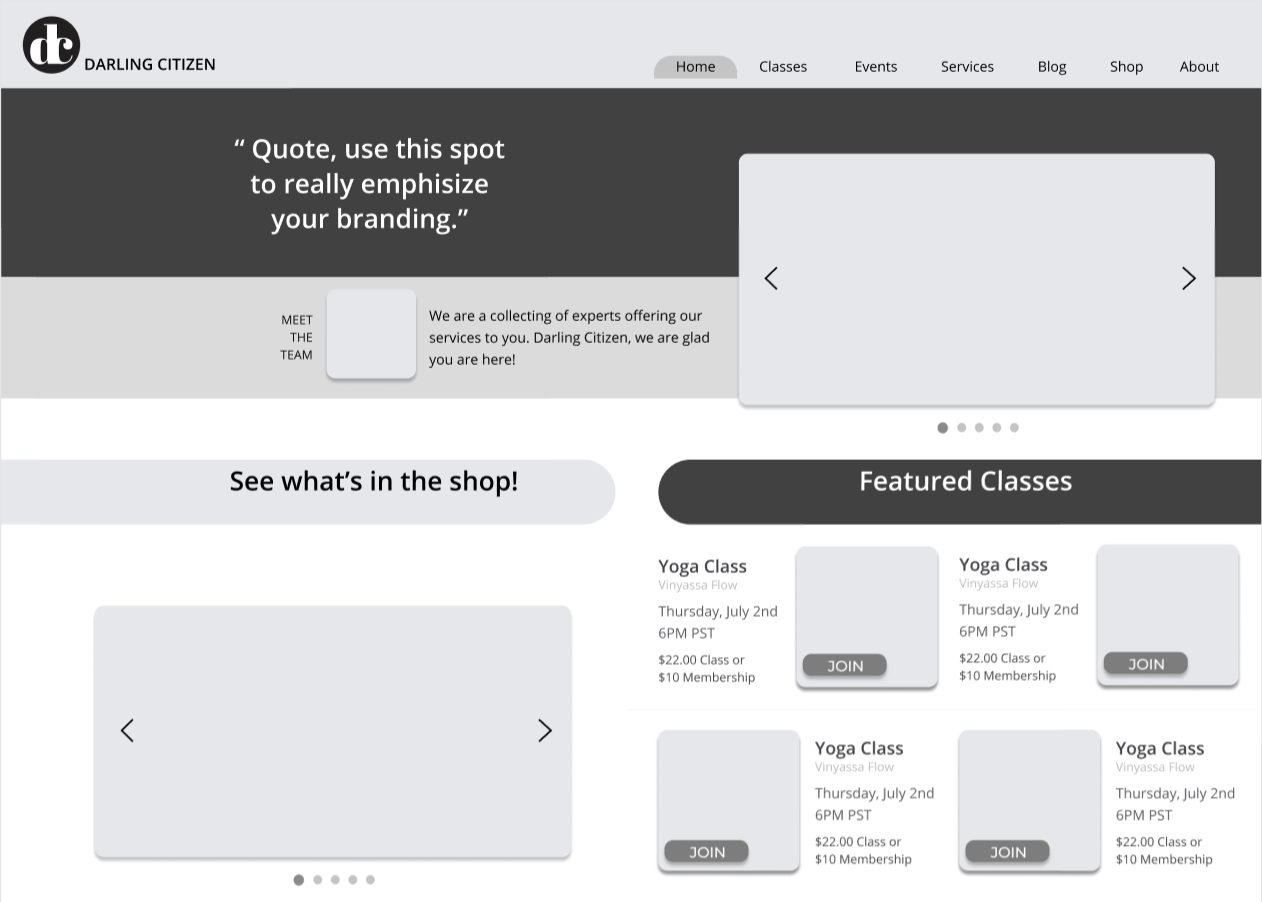
Next, I started building the rest of my prototype in Figma.
Although I ended up hitting a snag. After consulting with a senior UX designer, I was informed that the web version of my design would make a developers job difficult and he urged me to better utilize the space.
So I designed these alternatives and did a quick comparison with my friends closest to the Darling Citizen target market before pushing forward. The one outlined in black is the one that tested slightly better and became the face of my prototype.
USER TESTING
With the help of Maze, I put the prototype to the test.
The first task was to select a class of choice and get to the payment screen.
Note: There was a fair amount of miss clicks during this task, but it seemed to stem mostly from users exploring the site, not from any misunderstandings of how to use it.
NEXT UP
I tested my solution for profitability and gained memberships. My design was inspired by the payment model from Brit + Co.
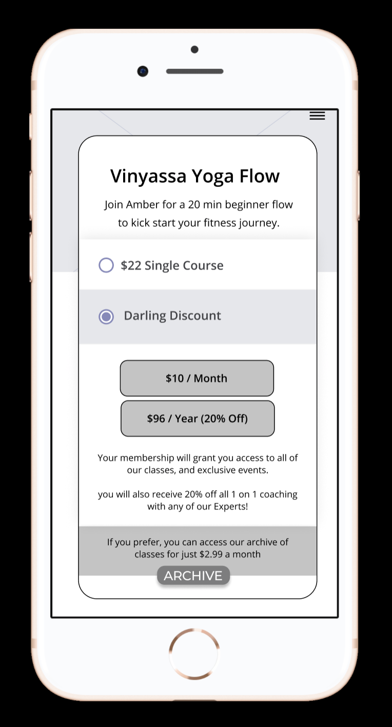
It is designed to nudge users into memberships with the offer of discounts and incentives, and also designed to give users multiple choices.
Memberships were very popular with four out of five users choosing them.

When asked why, it was clear that the incentives were working.

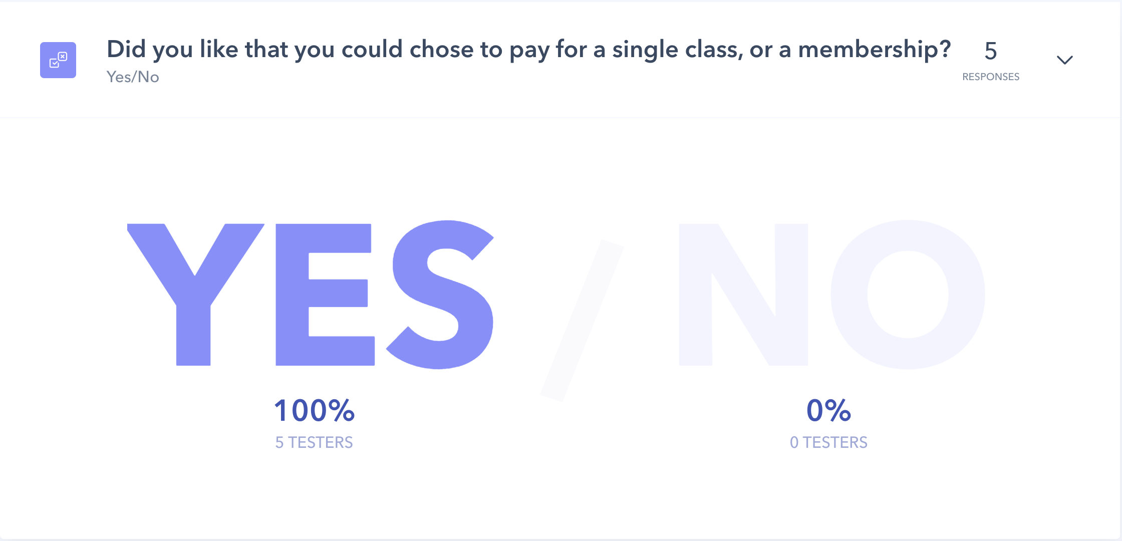
NEXT UP WAS THE CLASS BUTTON:
All users found this feature easy to use, rated five out of five across the board.
Although in actuality this receipt would be sent through email, so users would have to enter the class from there, which could lead to possible complications.
To limit complications, I would recommend sending an email at time of purchase as well as 30 min before the class start time.
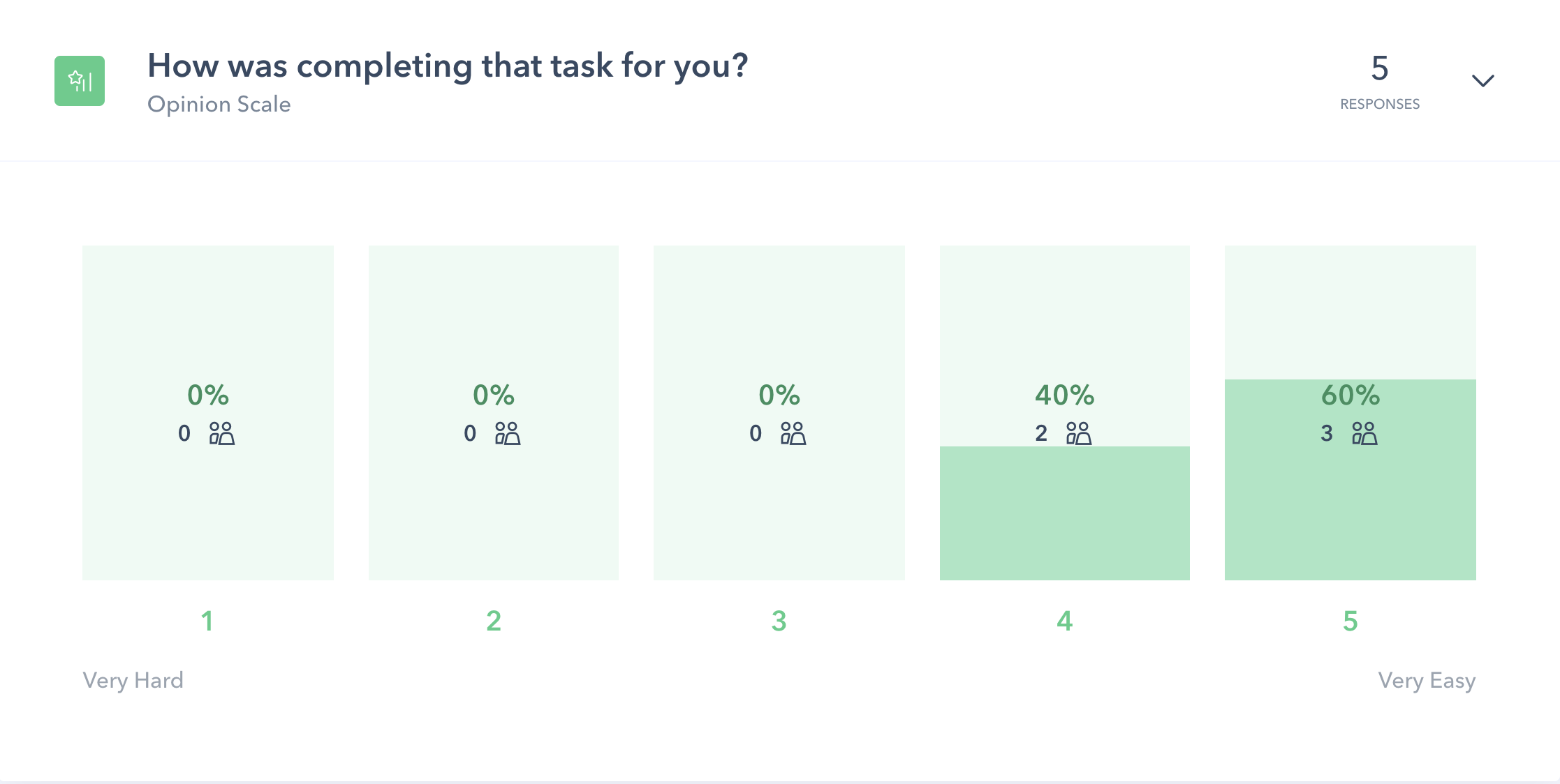
LASTLY I TESTED THE FEEDBACK:
This section is designed in part to check in on user experiences.
Feedback would give Darling Citizen quick insight on classes and the ability to assess and improve the user experience.
The class level question was also put in as a way to try and properly label classes, as Darling Citizen has had a problem before with the class level not meeting users abilities or expectations, which lessens the likelihood a user will return.

The class level question was also put in as a way to try and properly label classes, as Darling Citizen has had a problem before with the class level not meeting users abilities or expectations, which lessens the likelihood a user will return.
The majority of users liked that they could leave feedback. One tester wished she could leave specific feedback and another tester didn’t want to leave feedback at all.
NOTES AND QUOTES:
THE GOOD:
Overall the features tested well, and the solution to nudge users into memberships worked incredibly well. This is what the testers had to say about the prototype:
“On a structure level, I think it’s great!”
“It all seemed Intuitive, easy!
“I like that you can sort the classes by category!”
THE BAD:
There were a few issues with usability, one user didn’t see the single class option at all, and another didn’t understand that the classes side scrolled on the desktop version.
There were also some issues still with clarity. The site concept came across clearly and was an improvement to the existing site, but some of the details were still not clear. This is what the testers had to say:
“How often is the class offered?”
“What exactly does a membership get you?”
“What is the difference between a class and an event?”
THE QUESTIONABLE:
The strong language “bullshit” elicited a strong response, mostly positive, but not entirely.
The archive option was of little interest.

CLARITY
In an attempt to find additional clarity, I did a card sorting exercise with some of the testers to see how they understood titles, and how they would organize information.

PROPOSAL
I proposed these changes to the founder of Darling Citizen:
To clarify language throughout, most importantly about what a membership gets you, and how frequent classes are.
To restructure the menu options based off of input from the card sorting exercise.
To make the class side scroll area more clear and better spaced on the desktop version.
I recommended taking out the archive option altogether. It did not draw much attention or interest (partly by design) but I also think it competes with the other more profitable options, and dilutes a solution that tested well.
Since the membership sign ups tested well, I would need to add a sign in flow for returning members.
I would consider if there was a more quantifiable way to collect data about the class level to make the input more accurate and helpful.
To implement the class feedback and ratings into the class description since it tested well.
To make the payments section into screens rather than overlays to ensure customers feel that the payments are secure. (This did not come up in testing, but was brought to my attention by two senior UX Designers)
CONCLUSION:
Overall I think this prototype tested very well, and solved the problems that this design sprint set out to solve: Transitioning to a paid model, increasing membership, and offering clarity.
Understanding what the site was about, as well as the simple button to get to class were certainly successful in improving clarity, but with just a few slight adjustments, I think the overall solution could be even stronger.
All recommended changes in the previous section have been signed off on, and I am currently in the iteration phase and beginning to work on the high fidelity mockups.
UPDATES:
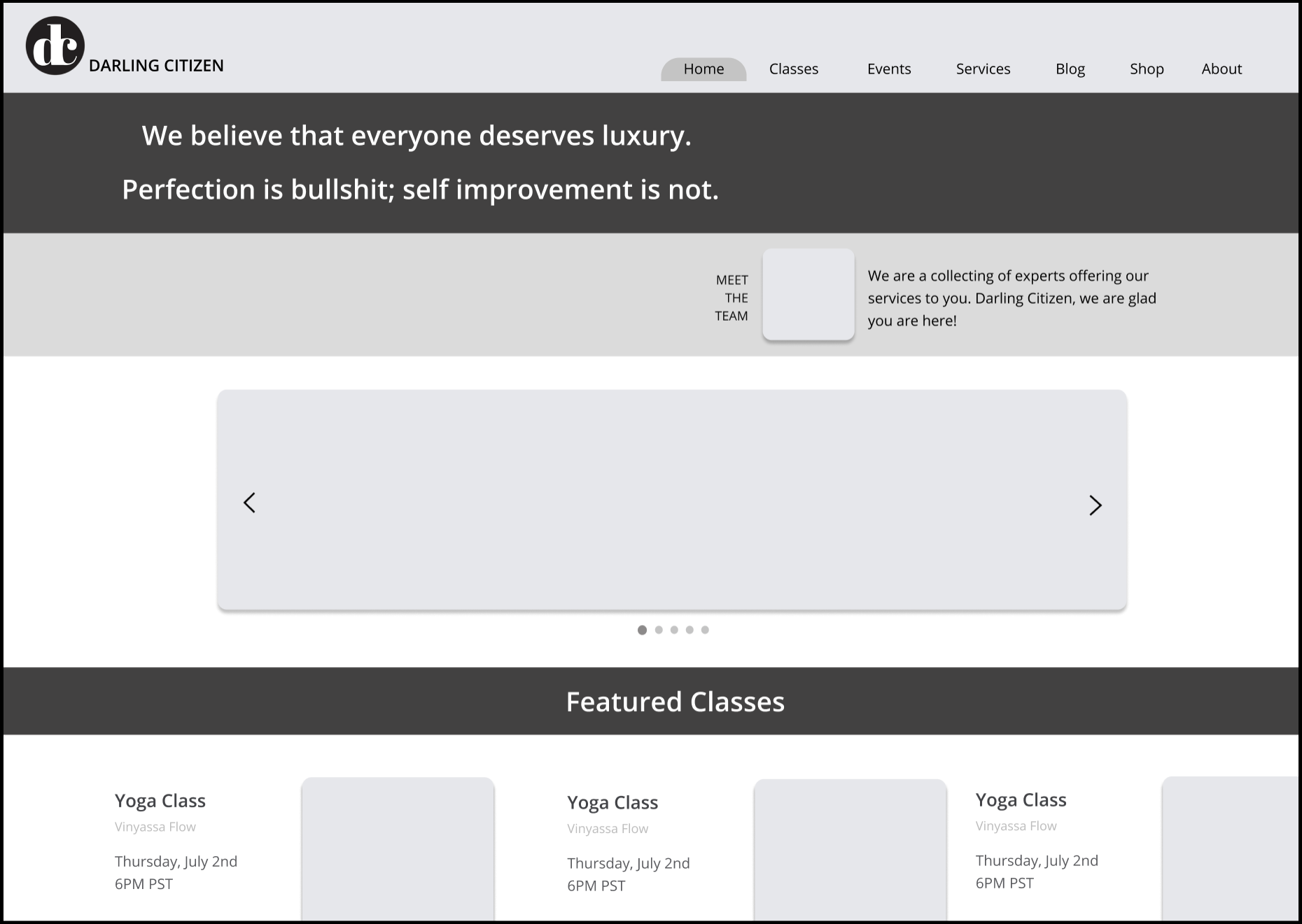
I have done the UI design for the existing user flows, restructured the menu, taken out the archive and updated language throughout. To improve accessibility and usability, I have enlarged both the header and body fonts and I have also made the overlays in the web version part of the screen to ensure that users would feel more confident in their purchases.
UI DESIGN:
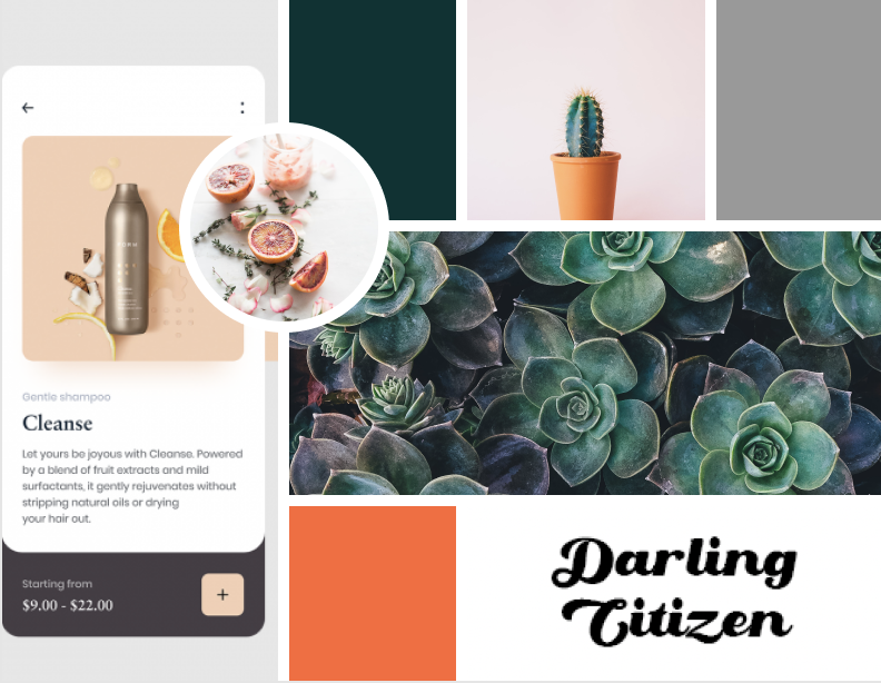
My client knew what she wanted her signature font to be, but to guide her towards color choices, I first gave her some color picker tools, but those were overwhelming to her, so I then had her choose an image that really resonated with her, and I pulled colors from there.
I then made a mood-board and creative brief before I started designing.
Once I had the home screen designs ready, I ran a preference test before developing out the rest of the site.

I have however not yet developed the flow for the memberships sign in, prepared the files for export, or tested these updates as the client is looking to raise capital first.
