EMBARKER
MOBILE REDESIGN FOR A CITY TRANSPORTATION AGENCY TO DELIVER INFORMATION IN REAL TIME AND COMMUNICATE ABOUT DELAYS.

ROLES AND RESPONSIBILITIES
My responsibilities included user research, concept ideation, designing user flows, visual design, branding, prototyping, user testing, incorporating user feedback into design iterations, and quality assurance.
SCOPE AND CONSTRAINTS
The scope of the project was to complete the user interface for the MVP (Minimum Viable Product) using the information provided by the cities new tracking technology, as well as rebrand and create a cohesive design system.
One of the largest constraints was that research and usability testing was limited to what I could do remotely due to Covid-19. If circumstances were different, I would have also included an ethnographic study into my research.
OVERVIEW
This Redesign was for a transportation agency for a midsize metropolitan area.
Accompanying the redesign, the city has recently developed a way to know how far away each bus is from a stop and they have also significantly expanded their service.
Through their research they had already discovered two goals.
To let riders know when their next bus will be arriving.
To let riders know how much time they have to get to their bus stop.
RESEARCH
I made a detailed research plan to find, survey and interview potential users of the app.

OTHER IMPORTANT TAKEAWAYS
Through user research, I not only confirmed the city's goals, but I also discovered a few other important takeaways.

Most riders used three or less bus lines, and typically went to the same places.
I learned that accuracy is of utmost importance to riders.
Riders wanted to know how busy their bus was going to be.
I also learned through user interviews that what originally appeared to be a desire for accuracy, was actually a desire for communication.
PROBLEM STATEMENT
How do I get the bus riders the information they need in real time?
Using what I learned, I combined the city’s goals with the research I conducted to outline the main goals of my MVP .
To notify the user when their next bus will be.
To notify the user when they need to leave to get to their stop?
To send relevant communications with riders about delays
To show users how busy the bus is going to be.
To design for commuters who typically use the same lines regularly.
USERS AND AUDIENCE
Bus riders vary a fair amount in basic demographics and backgrounds but I designed this app with two main personas in mind, which I based off of my surveys, and interviews.

My first persona is Jerry, a no nonsense commuter in his 40’s who’s only mode of transportation was the bus.
My second persona is Sandra, a responsible first year college student, who often rides the bus, but also shares a car with her family.

EMPATHY AND JOURNEY MAPS
Using input from the user surveys, and interviews, I created empathy and journey maps for my personas.

SOLUTIONS
After conducting a competitive analysis of other transportation apps, I began starting to think of solutions based on my research.
MEETING BUSINESS NEEDS
• To be able to tell when the next bus will be
• To tell when the rider would need to leave to get to their stop
I could meet these two goals simultaneously. I modeled this solution off of other apps that have previously solved this design problem well, by using simple text
COMMUNICATION GOALS
My first thought was to implement community feedback, perhaps something similar to how waze works, but since this was for a small metropolitan city, I didn’t think that solution was the appropriate scope for the project.
I still wanted a way for riders to communicate, so I decided to add the cities twitter feed directly into the app, with options to search a specific bus-line hashtag or tweet.
During my interviews, I discovered some riders were checking twitter independently to check for delays on their commute. And during my competitive analysis, I saw that some transportation agencies, like the SF Bay Ferry used twitter to notify riders of delays and alerts.
So my solution was to use that premise, but integrate it into the app, similar to how slack has in app twitter updates.
DESIGNING FOR COMMUTERS:
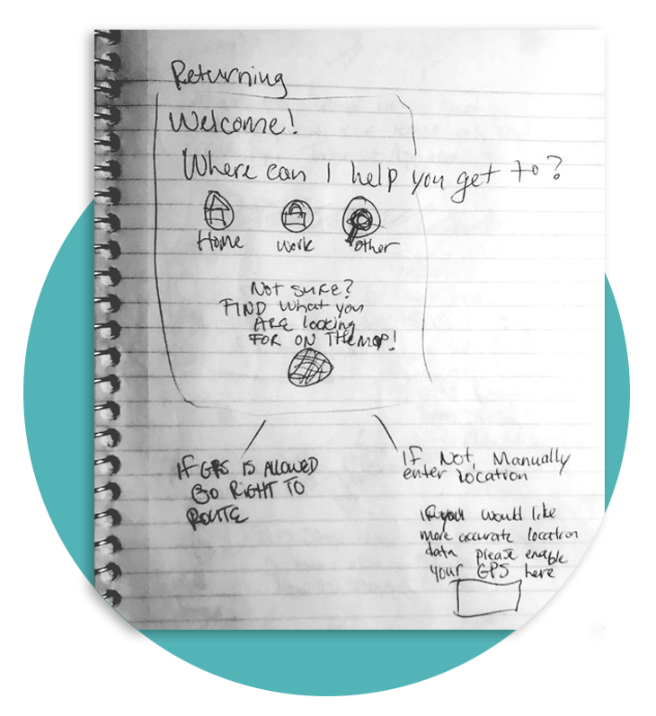
I wanted to make the navigation process as easy as possible with my users in mind. With consideration that they typically used the same lines regularly. My solution was to use a simple three button solution, with a home, work, and other button.
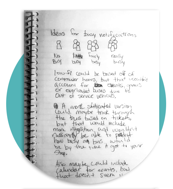
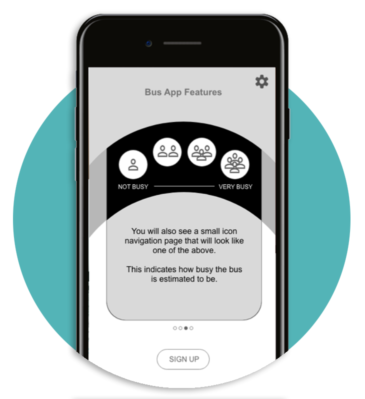
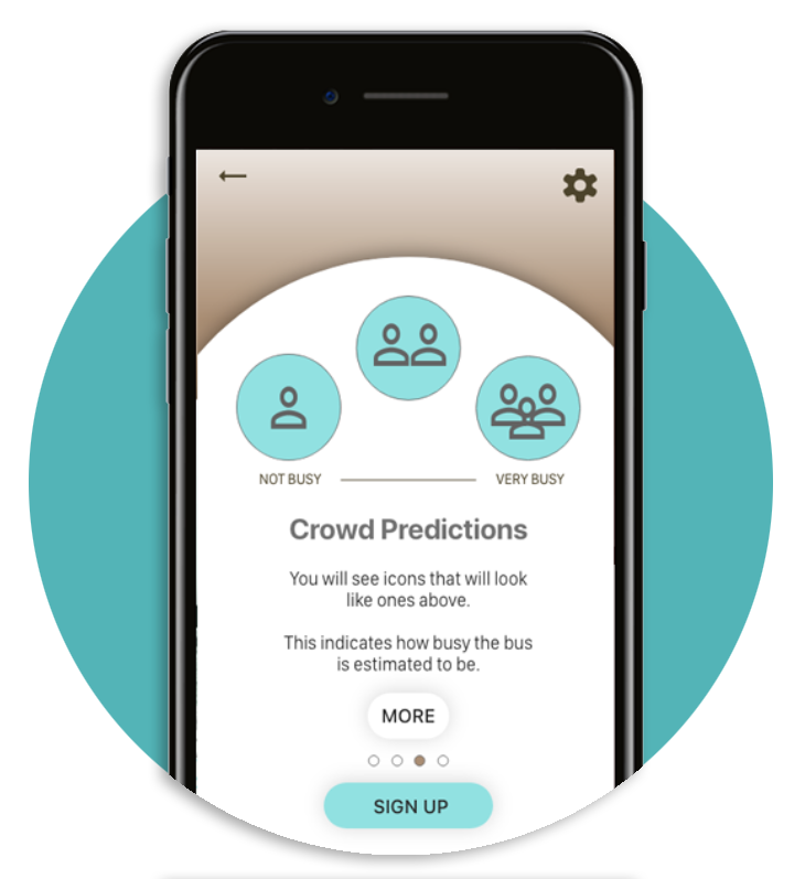
CROWD INDICATIONS:
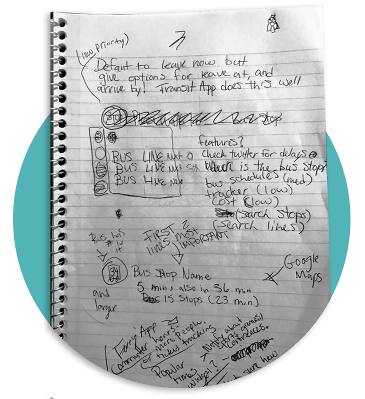
I first thought about how google estimates how busy somewhere might be, but that seemed way out of the scope of this MVP. I wanted to make sure that the crowd indications were simple and to the point, so I sketched out a few options, and decided to test out the icons pictured in the notes above.
USER FLOWS
My on-boarding flow was fairly complicated, as it was essential for the three button system for commuters to work. I was eventually able to design from download to the navigation page in just three screens.
Also the returning user flow would be much less complicated, starting at the “Where to” label towards the bottom of the screen.

WIREFRAMING

I started with paper sketches, which later became digital wireframes.
USER TESTING
I then did remote problem discovery user testing. During user testing most of the features I was specifically testing, tested fairly well, but some things needed work:
• Problems with clarity of language and symbols.
• Users were not always able to navigate backwards.
•There was some confusion with the navigation bar.
• Onboarding was overly complicated, it had too many screens.
I prioritized redesigning those elements before pressing forward.

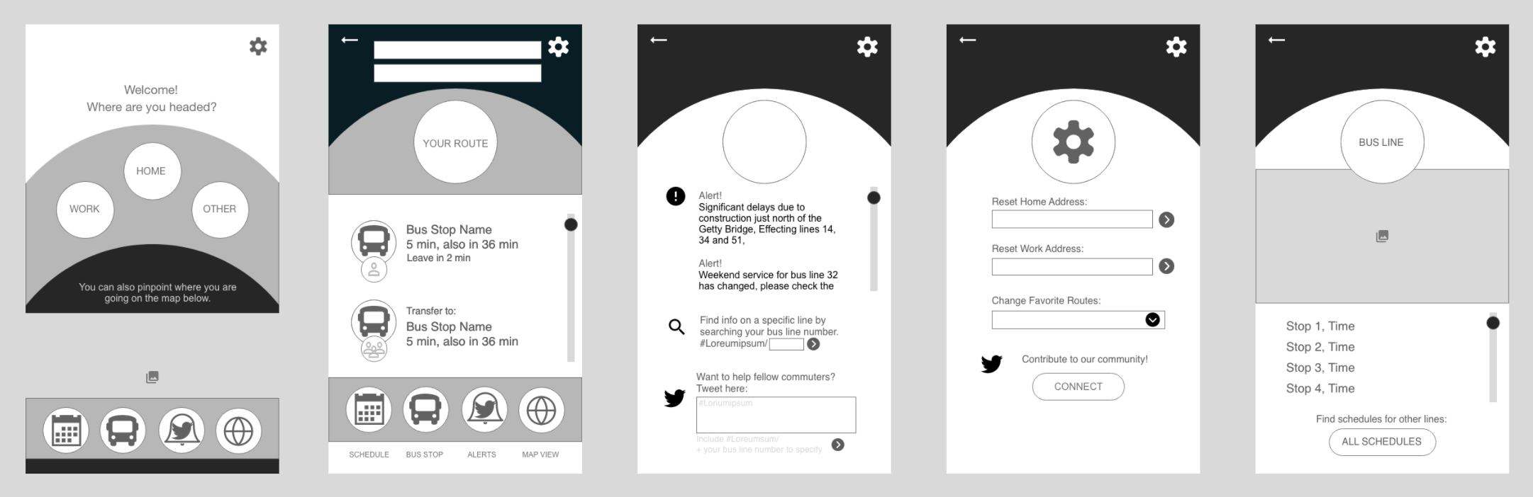
Originally, there was a different screen for all four elements to the screen on the right, but after input from testing, I simplified it into a single screen.
I also moved to a single signup option, and made the exploration of app features optional after user testing.
UI DESIGN
In this stage I focused on branding, color and typography to make the design come together.
I renamed the app Embarker, (plural for embark) which represents the many people who use the bus together, this branding is reinforced by the social aspects of the app.
I also used a limited color palette based on psychology research. The color brown represents strength and reliability, and the color teal presents as a friendly and happy color. Based on the research, a reliable brand seemed to be important, but I also wanted to make sure it felt accessible and friendly.
I then put it all together into high fidelity mockups.

ACCESSIBILITY
I made sure font size was legible, and at this stage I upped my body text by 1pt.
I checked that contrast met recommended guidelines, and darkened my skip buttons as they needed to be higher contrast.
I also added wider clickable areas around the back arrows to make them easier to press.
I made these changes to make sure the product would be accessible to more people who may have visual or or mobility impairments.
DELIVERY AND ITERATIONS
In this phase, A moderated remote problem discovery test was conducted through zoom, with a follow up survey.
A few more problems came to the surface:
• Testers didn’t match my original personas, making the commute focused design less accessible for this test group.
• Many testers wanted a larger map.
• Some testers were struggling to differentiate if the bus lines were buses they had to transfer to, or if they were alternative routes.

I then wrote an in depth usability report, that you can read in it's entirety here:
Using that information , I refined my prototype to meet these newly uncovered needs, such as making the transfers more clear by creating a visual hierarchy with size and indentation. Also by making the map a larger pulldown and taking out the "your route" icon. I then prepared the design for export.
OUTCOMES AND LESSONS
OUTCOME:
Overall the design was a success, I was able to get the users the information they needed and it included all of the previously defined goals.
The design tested well during the usability testing, and testers were comfortable navigating the app.
LESSONS:
The relatively small sample size of my research and my lack of previous experience contributed to me missing a very important persona, “The casual user”.
In addition to the changes on the navigation screen, the welcome screen had to be modified to include a navigation bar, and the other button had to be changed to make the design accessible for this newly discovered persona.
Another important lesson for me was to simplify language and icons. I over designed and over explained at first and it took a couple of reiterations to become more clear and concise.
For example, three Icons represented how busy the bus was just as efficiently as the four did, so I simplified.
LOOKING FORWARD
If I were to design a second iteration there would be some additional features that I would be interested in exploring and researching.
A TICKET SYSTEM:
I would want to include an in app ticket system, where riders could purchase their tickets directly within the app. If that were done alongside a system that could scan the tickets on the bus, it could also populate more accurate bus crowd estimates.
A VISUAL TRACKER:
I would consider implementing a visual tracker where riders could visually see where they were at all times, much like when you ride in lyft or uber. This came up in the user interviews, but didn't seem to be the highest priority.
WEATHER INTEGRATIONS:
Where the app would remind you to grab your umbrella, or snow boots based on weather. This could potentially lessen the chance a rider is left out in the cold, and improving their bus riding experience.