TATTER APP
A Digital waiver and communication tool for tattooers in a changing world.

ROLES AND RESPONSIBILITIES
I am the product designer of Tatter App. I led all facets of design, from ideation, research, information architecture, user flows and wireframing, prototyping and testing. I was also responsible for interaction, visual, product and branding design.
SCOPE AND CONSTRAINTS
To design the MVP of Tatter App.
OVERVIEW
Tatter App is a Digital waiver and communication tool for tattooers.
I have been a tattoo artist for 11 years and many tools that work for other industries do not work for the tattoo industry.
With Covid-19 changing the landscape, I wanted to make a contactless way for tattoo artists to complete their sign in waivers.
PROBLEMS STATEMENT
Covid-19 has made paper waivers a big ordeal, now needing to have a jar of clean pens / dirty pens, cleanable clipboards, and gloves to handle ID’s. The sign in process wasn’t the most efficient system to begin with, but the pandemic made it clear that there was room for improvement. I needed to address these problems:
How to make a contactless digital sign in?
How will clients submit their ID’s (to check age, and meet health department requirements)
How will tattooers make custom waivers/ documents and access the completed waivers?
How to make the process easy for tattoo clients?
RESEARCH
I know the tattoo industry well, but I wanted to see if my assumptions for what was needed were right.
Beyond the app itself, I also considered some common psychological traits amongst tattooers, such as:
Distrust of non tattooers.
Importance of aesthetics.
Wanting to appear professional, but not boring.
Interest in customization and personality.
I then launched a survey to 50 tattoo artists, and Interviewed 3, all of whom I had never met to make sure I wasn’t harboring any biases.
SURVEY FINDINGS
I asked tattoo artists to rank on a scale of 1 - 5 (5 being the most important) What processes they though an app could help with with 83.7 % of respondents ranking Waivers as a top priority, and 73.5 % or respondents ranking Record of ID’s as a top priority, below are some other features so you can see in comparison.
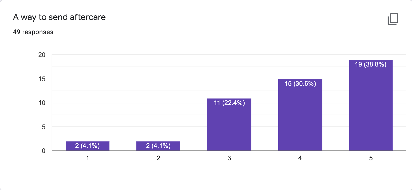
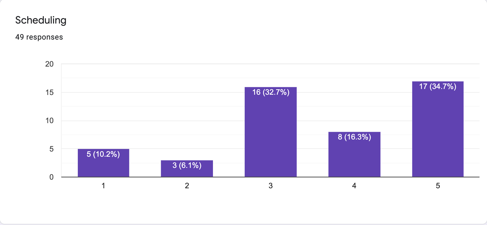
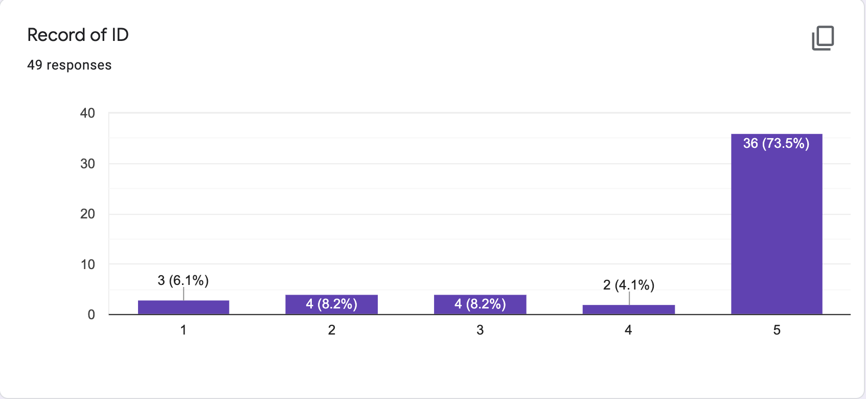
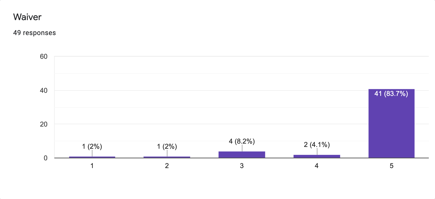
My assumptions were correct, that there was a high priority for sending waivers and collecting ID copies, thus solidifying the MVP idea.
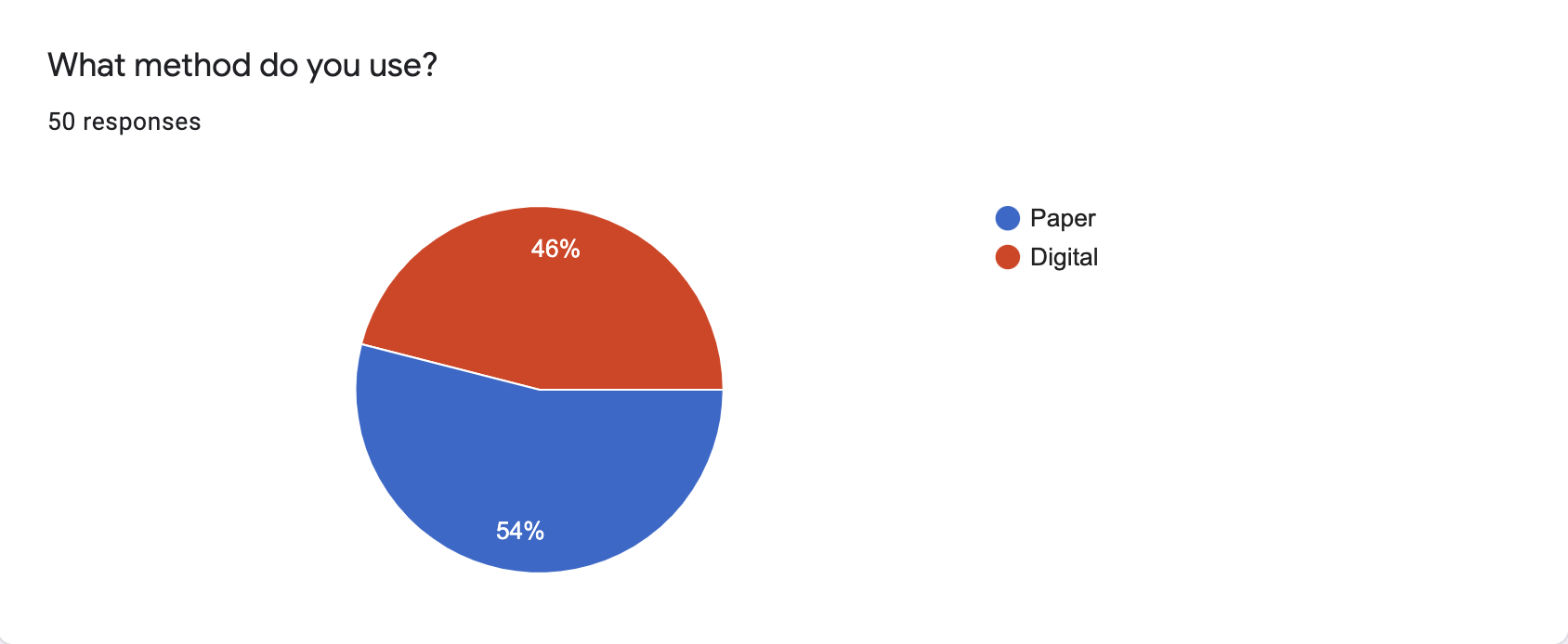
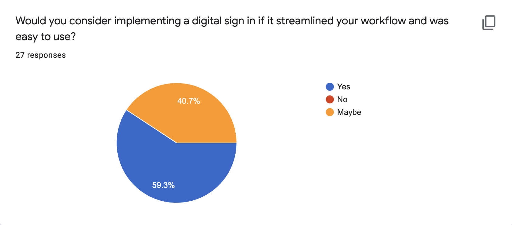
I then asked about the artist’s current sign in process. A larger portion of artists than I expected had already switched to digital, and out of the 54% who were still using paper waivers, all respondents said they would want to or would at least consider switching.
INTERVIEWS
Through interviews, I confirmed my suspicion that tattooers wanted to support other tattooers, not big corporations and I quickly learned that many of the tattoo artists that had switched to a digital waiver system had pretty severe pain points.
There was a free product, but it felt dated, clunky, and not that user friendly
Paid services were either outrageously expensive or didn’t suit the needs of the tattoo industry.
I then conducted a swot analysis of competitive applications which confirmed much of what I was hearing in the interviews. You can see the full analysis below.
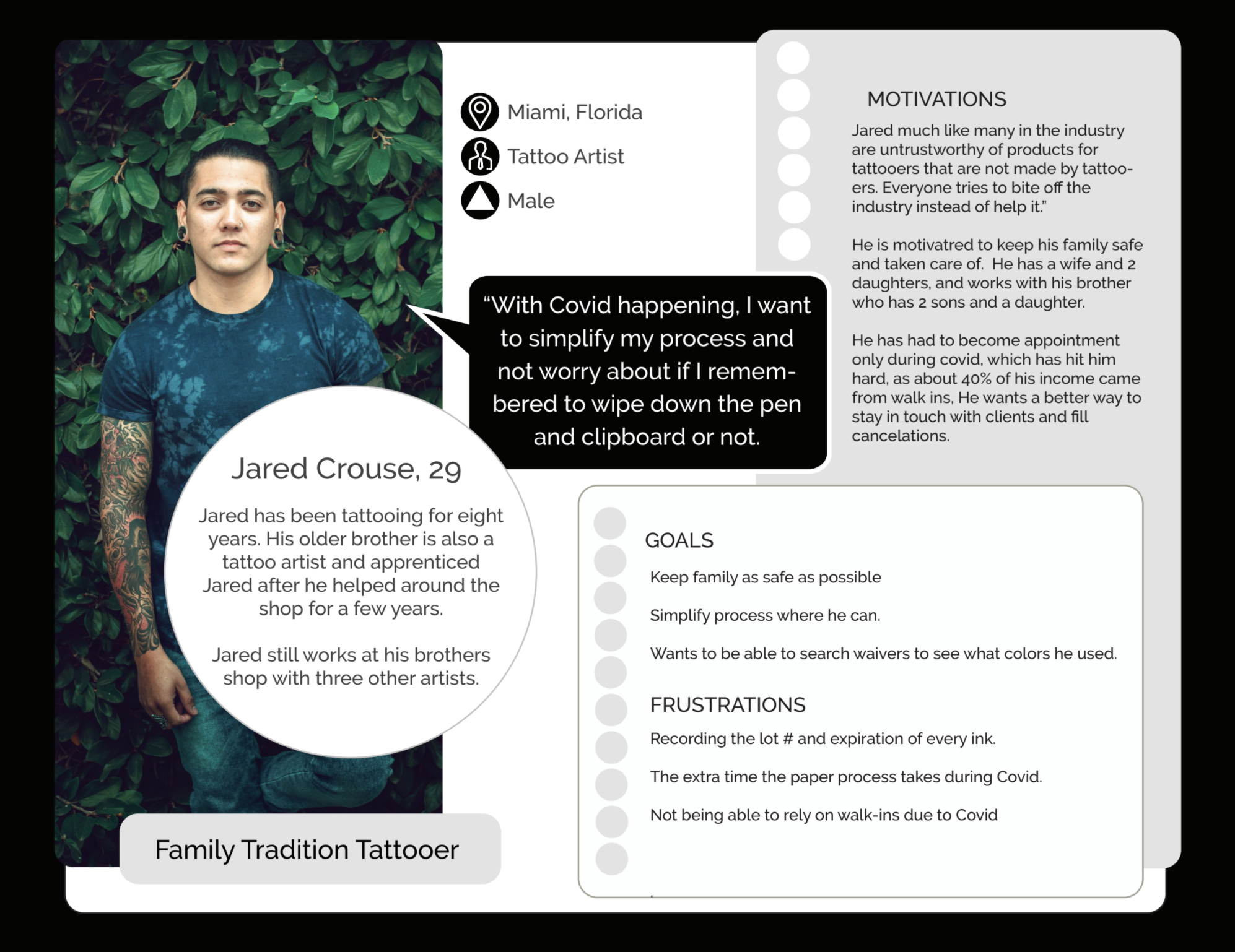
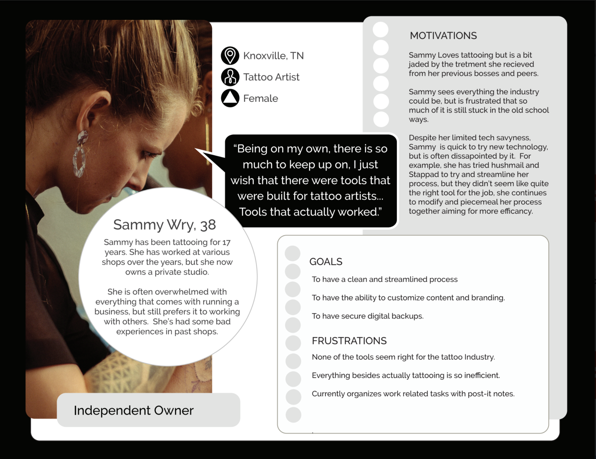
PERSONAS
I then created personas and user stories based off of what I had discovered through research.
CONTINUING RESEARCH
Additionally I surveyed and interviewed tattoo clients to understand their perspective so I could address any pain points that they might have.
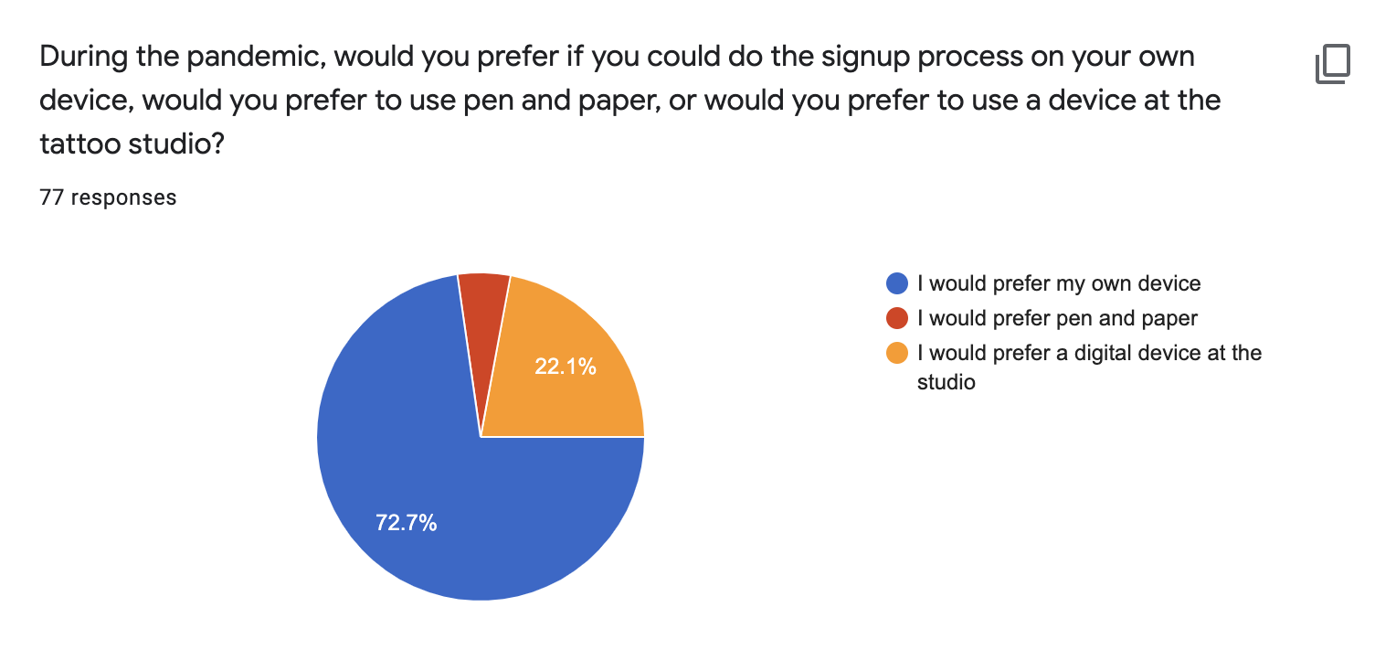
Another assumption proved correct: Pen and paper wasn’t working, not only for the tattoo shops, but for tattoo clients as well.
Some Additional insights:
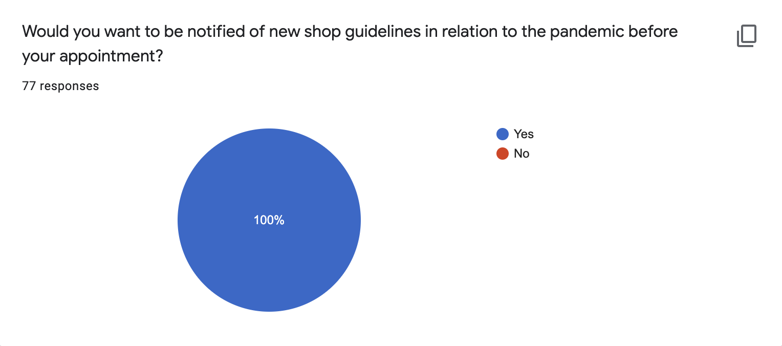
It was clear that adding an information page was very important to tattoo clients, and would be minimal effort to add once the infrastructure of the site was built.
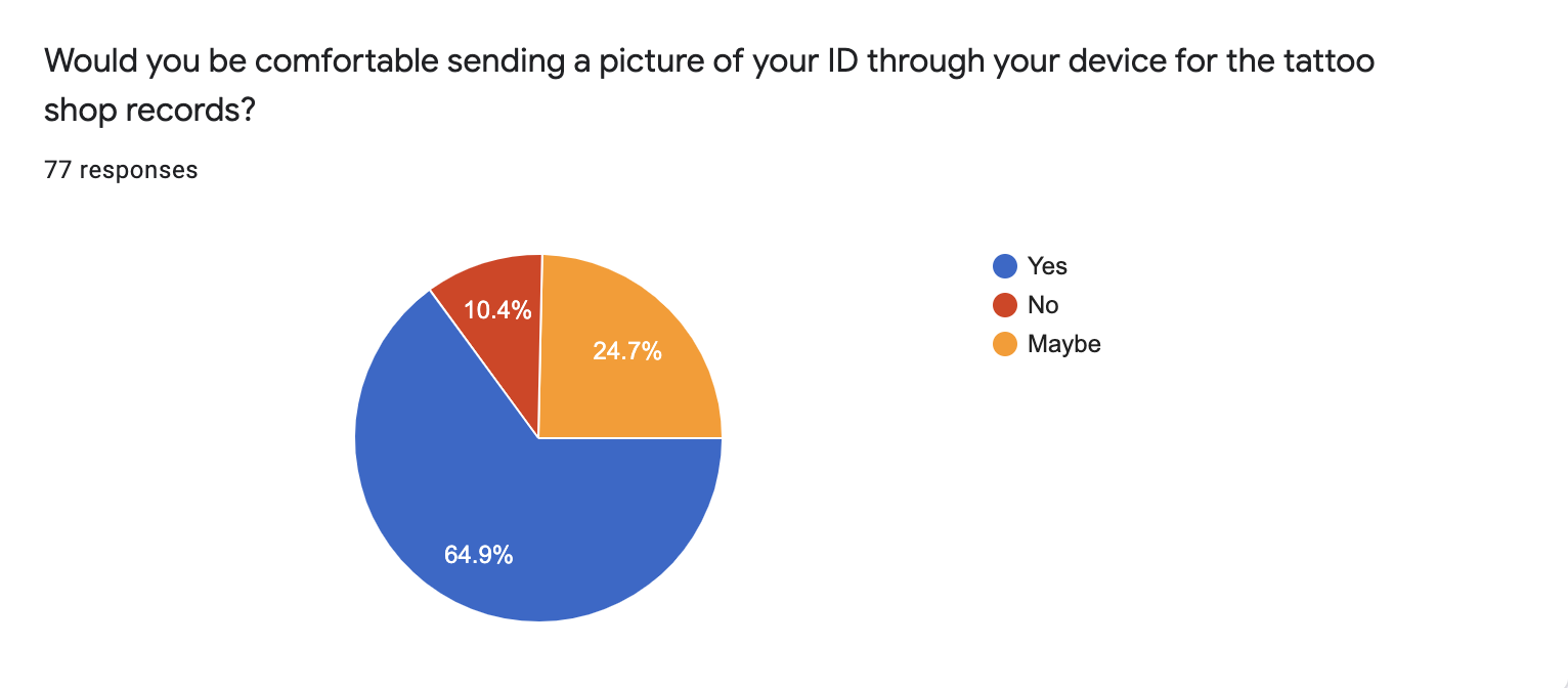
Security and shop reputation were the largest concerns for sending ID’s.
CONTENT STRATEGY AND SKETCHING
I wrote a content strategy plan and began sketching.

SITEMAP

Since information had to change hands multiple times, I wanted to visualize what that would look like.
WIREFRAMES
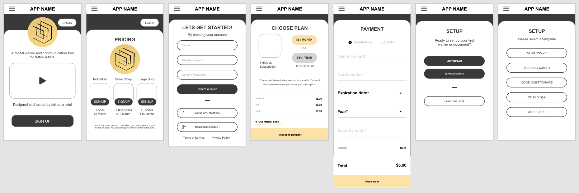
For onboarding of the app:
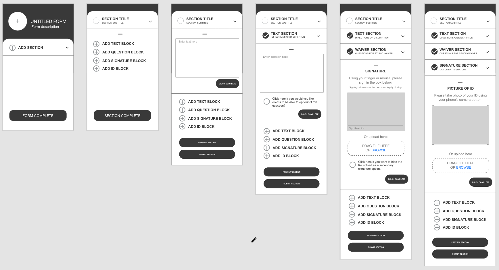
and the document builder:
CLIENT WAIVER EXPERIENCE
I prioritized keeping information in small and digestible bits. I utilized the concept of an accordion menu with preserved scrolling position to accomplish this. Even though it’s not a standard use of an accordion, it delivered a user experience that was easier to read and focus on than a traditional waiver, and also allowed the user to easily go back and re-read any section they might want to revisit.

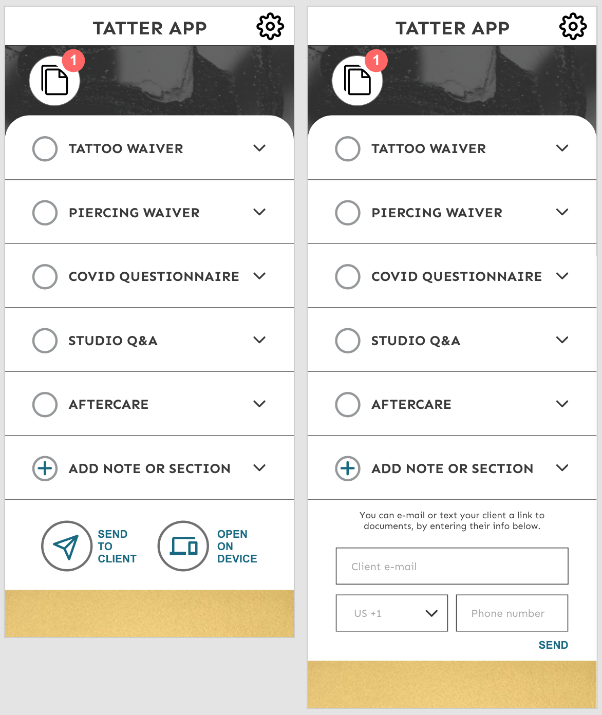
TATTOO ARTIST DASHBOARD
From the dashboard, a tattoo artist could send multiple files to a client by email. The dashboard would also alert when a new waiver came in. This would allow the artist to open up the document to verify the ID and add any notes, such as ink or needle lot numbers.

UI DESIGN
I first made a mood board.


I then focused on the name and logo. When brainstorming name ideas, I knew it needed to something that was easy to remember. Since this is for a web based app, being able to recall and spell it was of utmost importance.
Tattoo Digital Waiver or other similar names just didn’t roll off the tongue, so I shortened it to Tatter App. Tatter is an inside joke nickname for tattoo artists that is widely used in the industry.
Lastly I applied styling. I quickly realized that the red accent color that I originally selected might become confused with error messages and lead to a confusing experience for the user so I changed the accent color to this dark teal.

TESTING
The overall usability and aesthetics testing amazingly well, but I did discover a few important things my current design didn’t address.

Some tattoo artists use texting rather than email for client communications.
After being unimpressed with other software, there was a desire to try the product before buying.
I needed a way to allow clients to complete the waiver at the shop for those who are not tech savvy, or for shops who prefer to offer waivers in person.
ITERATION ROUND 1

Based on the feedback from testing , I added a place for tattoo artists to be able to text documents in addition to being able to email them.

I also introduced a free trial, but still offered a path for immediate sign-up with the incentive of a discount. I also shrunk the logo and detail text to try and keep distractions to a minimum, and make it more clear what to do despite the additional information.
During testing I discovered that some of the tattoo artists’ had older clients who didn’t have smart phones and struggled to even use e-mail. It was clear I needed a way to complete the waivers at the shop as well.
My first solution was to put the option to open the documents below the input boxes that you see on the screen to the right, but it was visually confusing, and I assume would lead to user frustration, so I instead made a more simple screen, that could then lead to the input boxes, making sure artists could easily see both options, and not be presented with unnecessary information.
Lastly, I wasn’t sure if my payment screen was clear enough on choosing between monthly or yearly plans. This wasn’t something that tested poorly, but the design was a bit disconnected from the rest of the site varying from previous learned patterns with the app, and somewhat difficult to tell which selection was highlighted, so I wanted to make an alternative screen to test.

MORE RESEARCH
I then did more discovery testing with the new changes. The free trial was well received, and the other changes caused no hiccups during testing.
Questions about the personal info section: One artist wanted to know if she could add in client nicknames, to make searching easier, another question was for preferred pronouns. While thinking about how to solve this issue, I realized that the personal information block was not included in the document builder, meaning that the software couldn’t build the waiver template I had made. I immediately set out to fix that.
ITERATION ROUND 2
My first solution was to add in a personal information section that was editable. After thinking about it further, I realized that people might need input boxes that went with a text or a question block, for things such as having clients list their allergies.

CONCLUSION
Successful! The Tatter App design successfully solved all of the initial problems that it set out to solve.
It is a contactless digital sign in.
It allows clients to submit their ID’s (to check age, and meet health department requirements).
It allows tattooers to make custom waivers/ documents and access the completed waivers.
It is a process that is easy for tattoo clients to use.
MOVING FORWARD
The next iterations of this product would include partnering with a developer, and solving many of the more technical problems of the site. The following problems need to be researched, addressed, designed and tested.
Does the current waiver with the checkmarks and the signature block count as a legal document?
How will ID’s be stored so they are secure yet accessible?
How would a medium or large shop dashboard differ from an individual user?
How would the waiver database be implemented?
Testing of certain aspects of this app such as the document builder will be much more informative once it is coded and functioning. I can currently illustrate the idea, but it’s not the same as building a waiver from scratch.
*Please note that prototype doesn’t yet cover all flows, as it’s a work in progress: